I’ve been told that statistics is about conveying a maximum of information as quickly and simply as possible. CEOs don’t have time for your flowery language! So I wondered, how would a data scientist squish classic stories into an snappy, digestible visuals? In charts of course! Here are a couple for your amusement:

 |
 |
| It ain't easy being at the end of the bell curve. |
In this one I tried to get fancy, and probably wrecked my
one rule of "quick and simple" stories. Oh
well, it’s funnier this way.
What's the point? Well, I made this as a response to my boss telling me to play around with displaying data in different ways, and thought I'd make it fun for myself.
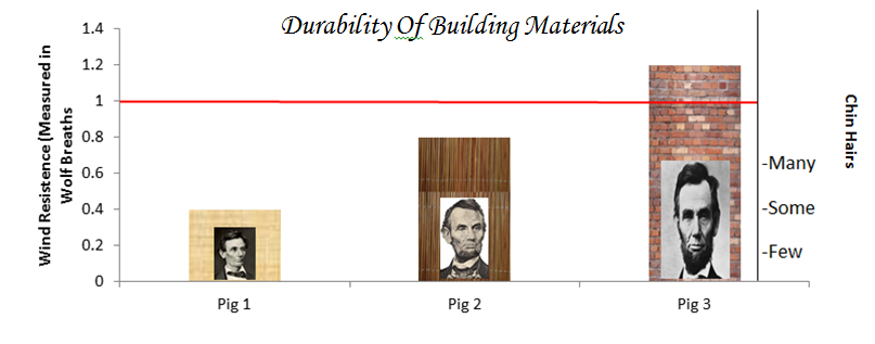
But really, when we visualize data, we shouldn't have to sacrifice clarity to make graphs enjoyable to absorb. Why not place Abe Lincoln next to our graphs if it's part of the graph's main point? Why not color code our bars and distributions to hint at what they represent? No legend is needed when your bar denoting bricks is made of bricks. This could increase the visual's "at-a-glance" or reminder value, as long as you don't get carried away. I digress, but the point is: how do you present information to other people in a way that is both creative and clear?
But really, when we visualize data, we shouldn't have to sacrifice clarity to make graphs enjoyable to absorb. Why not place Abe Lincoln next to our graphs if it's part of the graph's main point? Why not color code our bars and distributions to hint at what they represent? No legend is needed when your bar denoting bricks is made of bricks. This could increase the visual's "at-a-glance" or reminder value, as long as you don't get carried away. I digress, but the point is: how do you present information to other people in a way that is both creative and clear?
-Jordan
No comments:
Post a Comment